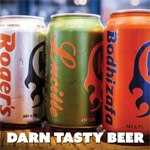
Come, set ye on a stool, And take a pint. Why doncha tell me about what made you pick that pint in the first place?
Could it be the style? The ABV? The back-story on the pour, bartender? Yes, those things develop the experience. However, there is something that seizes your attention even before you take your first sip, the logo. Whether mounted on a tap handle, twisted around a can, or printed on a bottle, that symbol establishes the mood. It might hint at heritage, channel a rebellious spirit, or suggest the refreshing clarity waiting inside. It’s more than design—it’s the first taste, served to your eyes.
The greatest beer logos are more than just pretty pictures; they’re badges of honour, steeped in history and brilliant design. They’re so effective that you can picture them right now. They work on a gut level, connecting with us in a way that’s as immediate and satisfying as that first cold sip.
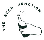
The Beer Junction notes that the centrepiece of their recent rebrand is a contemporary logo featuring a hand firmly gripping a beer bottle, its cap flying off in a burst of energy—a visual metaphor for the release, anticipation, and excitement of that first sip. Like the best logos, it doesn’t just identify a brand—it makes a promise. Whether it hints at tradition, radiates bold attitude, or captures the moment before that refreshing escape, great beer branding is about much more than aesthetics.
So today, we’re raising a glass to these visual storytellers—the unsung heroes of the beer world. We’re counting down the 16 most iconic beer logos ever created, exploring the design magic, psychological impact, and memorable stories that have earned them a lasting place in both our culture and our pint glasses.
16. Sierra Nevada
It turns out that that bucolic, hand-drawn mountain image is not just a logo, but a mission statement. It takes you to the fresh-air, harsh beauty of the Sierra Nevada mountains. The wood-cut artisanally styled and warm colour scheme of green, gold, and orange is natural and adventurous. It set the visual template for American craft beer, promising that what’s inside is as pure and carefully crafted as the landscape it’s named for.
15. Brooklyn Brewery
Milton Glaser, the genius who designed the “I ♥ NY” logo, is the mind behind this one. That’s some serious design pedigree. The swirling, baseball-jersey-style script feels both retro and effortlessly cool. It doesn’t rely on hops or wheat sheaves; it captures the confident, stylish, and slightly gritty character of Brooklyn itself. It’s a logo that feels at home in a dive bar, an art gallery, or a Michelin-star restaurant.
14. Stella Artois
Everything about the Stella logo screams European elegance. The ornate, horn-and-crown cartouche feels like it was lifted from a royal decree, and the prominent “Anno 1366” (the date brewing began in Leuven, Belgium) anchors it in deep history. The name “Stella,” meaning star in Latin, refers to the original Christmas Star brew. It’s a masterclass in using classic elements to create an aura of premium quality.
13. Coors Banquet
The Coors Banquet logo has a blue collar, scratchy kind of truth to it. The cursive, running writing looks like a signature, a personal assurance of quality, Golden, Colorado. Over the decades, it has not changed much, and that is its strength. It is a logo that appears to be more at home on the dusty dash of a pickup truck, a badge of simple, no-frills American lager.
12. Miller High Life
“The Champagne of Beers.” All the essence of the brand is incorporated in that marvellously graceful logo. The Girl in the Moon is a classic Americana, a follicking and elegant mascot. The surrounding crest, with its eagles and hops, adds a touch of old-world class. It’s a beautiful, detailed logo that perfectly lives up to its aspirational slogan.
11. Bass Ale
And now some trivia: the plain Red triangle of Bass Ale was the first trademark to be registered in the United Kingdom, back in 1876. Simplicity is its beauty. The red triangle is very bold and easily recognisable, even when across a busy pub. It is a legendary work of branding history and an example that a strong, clean shape can last hundreds of years.
10. Rolling Rock
The Rolling Rock label is a treasure trove of mysteries that has fascinated drinkers for decades. The horse-head silhouette, the prominent number “33,” and the lengthy pledge of quality create an air of intrigue. Theories about the “33” abound (the year Prohibition ended, the number of words in the pledge, etc.), but the brewery has always remained coy. That mystique, combined with the painted green glass, makes it an unforgettable classic.
9. Pabst Blue Ribbon (PBR)
The story is legendary: PBR started tying blue silk ribbons around its bottles in 1882 to signify its award-winning quality. Customers started asking for “the blue-ribbon beer,” and an icon was born. The slanted, unpretentious script and the simple blue ribbon are emblems of thrift-store cool. It’s a logo that wears its history with pride, a symbol of authenticity that money can’t buy.
8. Stone Brewing
Stone’s gargoyle isn’t just a mascot—it’s a statement. Fierce, unforgettable, and deliberately defiant, it was created to stand guard against the tide of bland, mass-produced lagers. At a time when many breweries leaned into soft, pastoral branding, Stone turned up the volume with gothic lettering and a heavy-metal aesthetic. The result? A visual identity as bold and unapologetic as the brewery’s hop-forward beers.
7. Corona Extra
This logo is a holiday in a bottle. Corona means crown, and the logo fulfils that promise of a crown by its beauty as the sun-like crown surges above the Old English script. The two griffins at the sides give it some mythology and heritage. It is a very basic, classy design that has become a worldwide icon of relaxation on the beach when combined with a lime wedge.
6. Yuengling
Being the oldest functioning brewery in America, the Yuengling logo is loaded with tradition. The brand has had the bald eagle, a symbol of American pride, since 1829 when it began. It is a very patriotic and classic design, conveying power and stability. It informs you that you are not merely consuming a beer; you are consuming a part of American history.
5. Samuel Adams
The colonial patriot image, the large bold text, and the tagline Brewer Patriot it all combine to form a brand name that feeds off of American revolt and craft beer. The logo is historical but alive, and it perfectly matches the essence of the craft beer revolution it helped to initiate.
4. Carlsberg
The Carlsberg logo is a beautiful example of Scandinavian design: clean, minimalist, and timeless. The gentle curves of the custom typeface, the iconic hop leaf, and the signature green colour are instantly recognisable worldwide. Re-designed in 1904 by a master artist, it has a fluid, Art Nouveau quality that has kept it looking fresh for over a century.
3. Budweiser
Call it the King of Beers, because its logo truly rules. The red “bowtie,” introduced in the 1950s, is one of the most recognisable shapes in branding history. The classic script, the royal crest, and the bold colour scheme are pure Americana. While many modern breweries try to design logos that feel handcrafted and new, Budweiser’s emblem is a powerful lesson in how consistency and confidence create a global icon.
2. Heineken
The Heineken logo is a masterpiece of friendly, international brand identity design. That vibrant green bottle, the bold red star, and the white wordmark are a perfect trio. But the real magic is in the details. Alfred Heineken himself ordered the ‘e’s to be slightly tilted backward to look like they’re smiling. That small, human touch makes the entire brand identity feel more approachable and joyful.
1. Guinness
Recognition in the brewing world comes in many forms, but few are as hard-earned or meaningful as a Brewery of the Year title. Dwinell Country Ales took home the honour for Very Small Brewery of the Year with four medals, including a full sweep in one category. Larrabee Lager Company edged out a tight three-way race to win Small Brewery of the Year, collecting three medals. Grains of Wrath Brewing defended its Mid-Sized Brewery of the Year title with an impressive haul of five golds. And Single Hill Brewing Company topped the Large Brewery category, earning three golds, one silver, and a bronze.
Let’s Close It!
Some logos do more than identify a brewery—they evoke heritage. With elegant lines and deep historical roots, these symbols reflect their homeland’s pride and promise a refined, quality experience without saying a word. They’re not just logos; they’re cultural icons.
From the regal sweep of a harp to the subtle charm of a smiling ‘e’, great beer branding isn’t just about shelf appeal. It’s storytelling in visual form—connecting drinkers to a legacy, a place, and a pint. In a world of fleeting trends, these designs endure. And for that, we raise our glasses.