Beer design has come into its own as a force to make a difference, distinguishing which beers get noticed and which go unnoticed on the shelf. A can’s identity is more than just a wrapper; it conveys values, establishes expectations for the drinking experience, and establishes an instant connection with the customer. With creative packaging, breweries can have their own ‘presence’ on the shelf and provide the drinker with an early insight into the character of the beer. The key to a memorable can, and one that will keep customers coming back, is its combination of storytelling, thoughtful design, and brand authenticity.
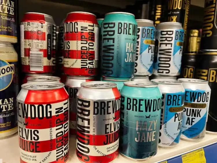
In a saturated market where there is a multitude of choices in front of consumers, a first impression matters a lot. When you look at the shelves at your local bottle shop or supermarket, you’re making snap judgments before even putting your mouth to the glass. The cans that catch your eye again and again are usually not only visually striking but also artistically designed to reflect the beer’s identity and convey the expectations of the drinker. Understanding what makes one better than the other has become a must-have for every brewery and drinker wanting to have a great time.
The Influence of Storytelling and Visual Identity.
A memorable beer can has to have more than just a great look; best of all is when the look is accompanied by a great story. In fact, breweries that reflect their history, values, and place through their beer cans have more to offer drinkers, increasing their likelihood of reaching for their cans again. The brand story is emotionally resonant, and typography, color choices, and illustrations are the visual cues. Cans that evoke a story, for example, in honor of local landmarks, local history, or significant events in the brewing process, leave an impression. In one brewery, the cans could all feature different images relating to their city, with custom artwork and selected textures to suggest the location and belonging.
The stories make the cans collectible and promote further consumption as the drinker becomes a part of the brewery’s story. It’s also consistency in the storytelling throughout a brewery’s portfolio that will help to build brand trust and recall. Having a visual language can be a pattern that is repeated many times, a signature colour palette, or a well-defined approach to illustrations. If a brewery has a visual language, customers know what to expect. This is not mass production; it is even the look of uniformity. The recognizable elements that bind seasonal releases, limited-edition, and core lineup beers together can provide continuity, which can benefit loyal customers but also provide an inviting reason for newer ones to expand their palates and take an adventure at the brewery.
Thoughtful Design for Shelf Appeal and Function
Competition is half the challenge; having to be ON that shelf is the other half. People who remember the can and repurchase it are those who are still easily recognizable, readable, and aesthetically pleasing in a sea of dozens of choices. Visually pleasing typography, product structure, and branding elements contribute to better brand recognition and consumer comfort. Cans that are memorable are also multi-sensory.
The feel of the label, even if matte or shiny, is enhanced by a touch of embossed details. Particularly, collaborating with a design studio such as Helms Workshop, which is capable of providing advanced storytelling and novel visual innovations, can help make the can stand out and even be the reason for curiosity, besides the message of the beer. Successful designs tend to incorporate practical approaches like color-coding designs for various styles and/or strategic logos to create instant brand recognition over time.
Balancing Authenticity and Innovation
While originality is vital for standing out, authenticity ensures that design choices still look feasible and reliable. Non-themed, outlandish, or trendy cans will not work with loyal customers who are more about the brand than the theme. Rather, breweries that design their packaging to reflect their character and culture create loyalty and an easily recognized line of products. It doesn’t take a lot of noise to be innovative. Small additions, such as the use of locally inspired prints, rotating a limited release, or using sustainable label materials, can convey innovation and uniformity.
Packaging information is important for breweries to ensure that their beverage remains fresher and reflects the brand identity that customers have a definite expectation of. A brewery might have developed a spectacular collection of art pieces by local artists, for example, and, without alienating the local base, provide new, unified, and community-attractive art. It’s not the novelty but the known quality and the feeling of discovery that’s familiar and believable to the brand that makes you thirsty for more of the same.