
The last news we reported about Full Sail Brewing Company was a year ago. That’s when one of the oldest craft breweries in the Pacific Northwest, and America for that matter, was acquired by Encore Consumer Capital, a company that describes itself as “an innovative private equity firm built specifically to help consumer products companies grow.” Read that story.
Today, Full Sail Brewing announced that it is undergoing a massive re-branding campaign, which it describes as a branding evolution, introducing a new color palette, hand-drawn artwork and contrasting design elements that vary from package to package.
“In an increasingly competitive craft-beer marketplace, we knew Full Sail’s packaging needed to be as notable and attention getting as the award-winning brews inside the bottle,” says Full Sail Executive Brewmaster Jamie Emmerson.
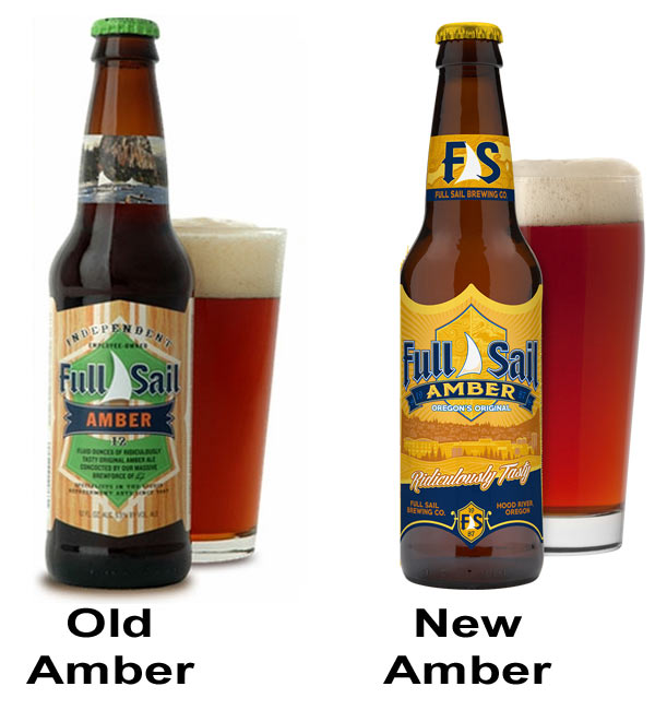
According to Full Sail Brewing, a good brew starts with great water, and the new packaging’s water imagery honors this magnificent resource. “A layer of spot varnish that evokes flicker and catches the attention of your peripheral vision and hand-drawn, wavy lines in a moiré illustration style are the guiding visual elements,” says MiQ Willmott of TWEEQiM creativeLab, who penned the artwork.
sponsor
sponsor

sponsor

sponsor

sponsor

sponsor

sponsor
sponsor
sponsor
sponsor
sponsor
sponsor
sponsor

sponsor

sponsor
sponsor
sponsor
sponsor
sponsor

sponsor
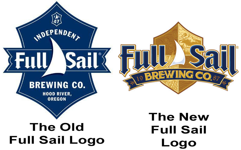
The new Full Sail logo and coat of arms is intended to breathe new life into the story behind the brand, highlighting the company’s Oregon heritage and connection to the winds that blow through the Gorge, Mt. Hood’s majestic beauty, the mighty waters of the Columbia and the abundant agriculture that supplies the brewery.


Full Sail adds that the subtle design elements on each package serve as a nod to Full Sail’s principles and priorities. A topographical map and GPS coordinates pinpoint the brewery’s location in Hood River and the Columbia Gorge, whose natural beauty and resources have always provided Full Sail’s inspiration. Artistic renderings pay homage to Hood River’s water sources, bounty of fresh ingredients, the brewery’s commitment to environmentally sustainable practices, and of course, the award-winning taste in each and every bottle.
“There’s never been a more exciting time to be a part of Full Sail,” says Full Sail Brewmaster Jim Kelter. “This rebranding reflects our pride and heritage as one of the original craft brewers as well as our vision for the future, which – more than anything – entails continuing to make delicious beer that we know our customers love.”
Look for Full Sail’s new branding on packages of Amber, Pilsner, Classic IPA, as well as its two new beers, Hop Pursuit IPA and Blood Orange Wheat Ale.
Cheers to our sponsors, like…


I agree the overall brand could use a refresh, but the new logo looks like an NFL logo, and the rest of the branding looks like a crafty beer.